Update, Change, and Manage the Data Used in a Chart in Excel
In this tutorial I am going to show you how to update, change and manage the data used by charts in Excel.
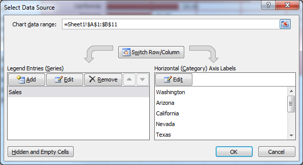
This tutorial is split up in order to breakdown the Select Data Source window into small and easy to understand parts. To edit the data selection of a chart, right click the chart and select the Select Data option - or select the chart, go to the Design tab, and click the Select Data button from the left side of the ribbon menu.
From now on the tutorial will discuss features from this pop-up window:
How to Change the Data Used in a Chart
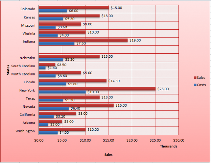
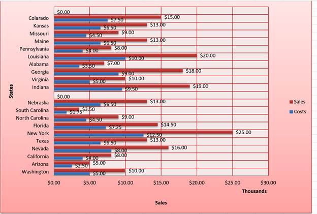
To change the data used in a chart, clear the current data reference in the Chart data range box at the top of the window (click the button to the right of the box to minimize the window if required) then select your new data. In the previous tutorial I only had 10 items for my chart. I will now expand this with a new selection:

Then click ok to update the chart:
How to Add Data to a Chart in Excel
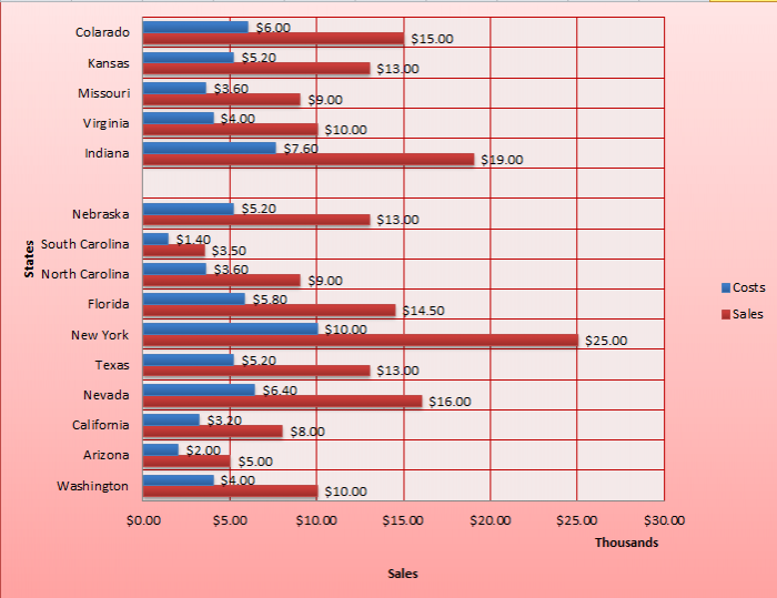
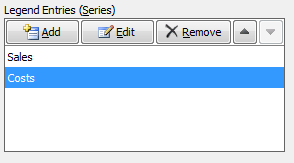
To add another data series to your chart, simply click the Add button. The following window will open:
This allows you to select a new series name and a reference to the cells which contain the new series data. Click ok to update the chart:
How to Remove Data from a Chart in Excel
To remove a data series, select it then click the Remove button. For example I am going to remove the data series I just added:
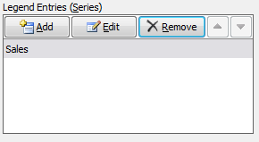
Then click ok to update the chart.
Note: I have added the Costs data series back in for the rest of the tutorial.
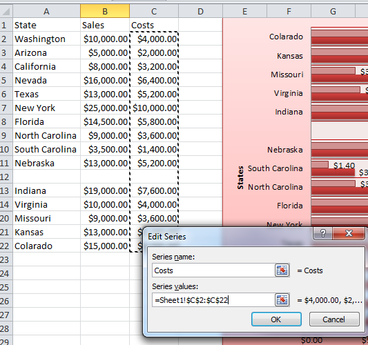
How to Edit Data in a Chart in Excel
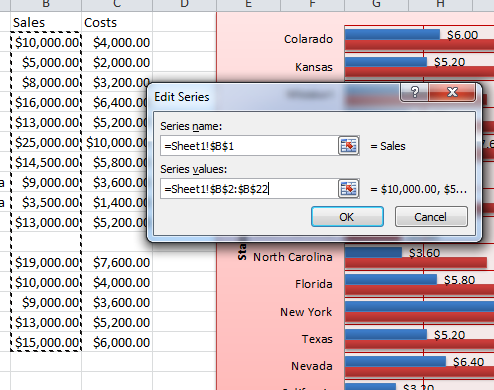
To edit a data series, select it then click the Edit button under the Legend Entries section. The following window will open allowing you to change the series name and referenced data:
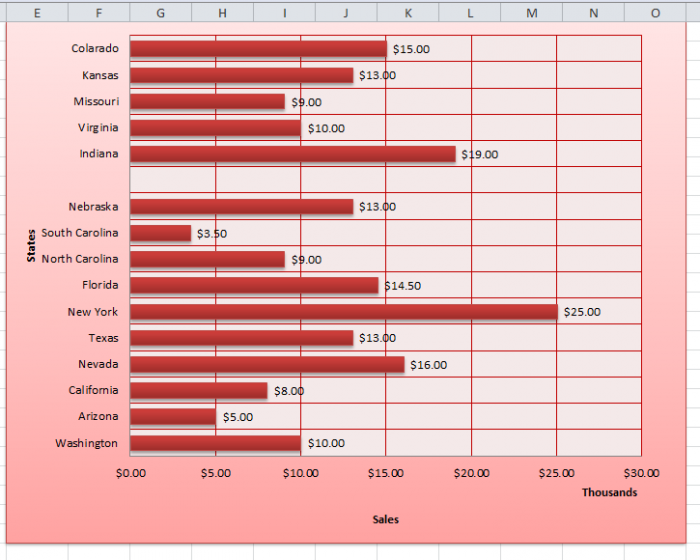
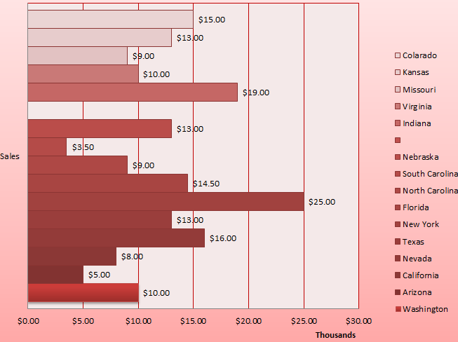
How to Move Data Series Up/Down in Excel
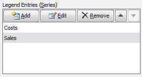
To move a series up and down, select it then click the up/down arrows to rearrange. So for example I am going to move the Costs data series up:

Then click ok to update the chart:
Notice how the bars have swapped round.
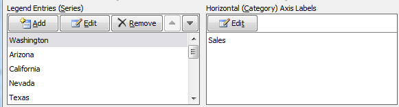
Switching Rows/Columns in Charts in Excel
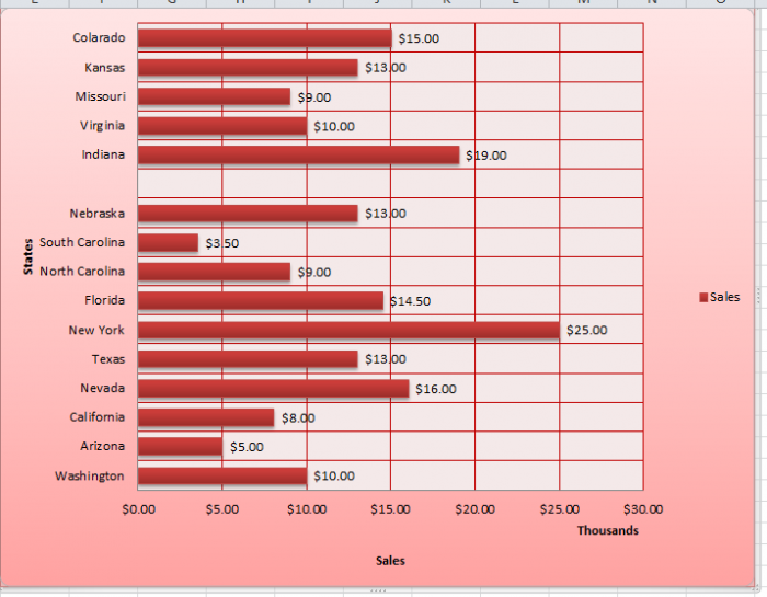
Switching the Row/Column of your data can come in handy if data in a worksheet has a poor layout. It can also give you an alternative layout for your chart, which may be better depending on how you plan on using your chart. Basically what this feature does is swap your Legend Entries (Series) round with your Horizontal Axis Labels (Category). This only works with 1 data series so I have removed Costs for this example:
Here is how the Select Data Source window looks before:
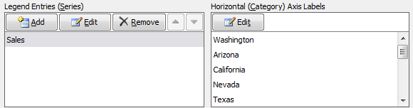
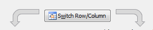
I then click the Switch Row/Column button, then ok to update the chart.
Notice how the States are now my key and Sales is on my Y-axis and the Legend Entries / Horizontal Axis Labels are swapped round:
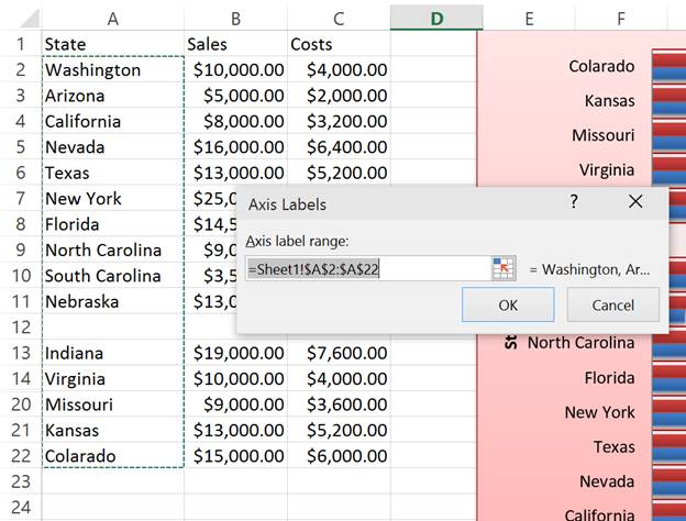
Editing the Horizontal Axis labels for a Chart in Excel
To edit the Horizontal Axis Labels, click the Edit button under the Horizontal Axis Labels section. This allows you to choose different labels for your charts data if you need to, just make sure the new selection is the same as the old one so all of your data will have labels.
The following window will open allowing you to edit the cell references for the labels:
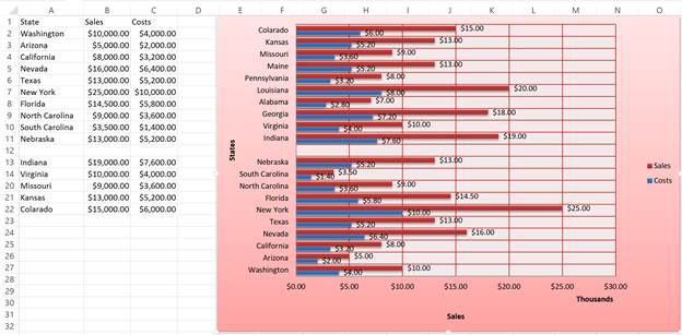
Hidden and Empty Cells in Charts in Excel
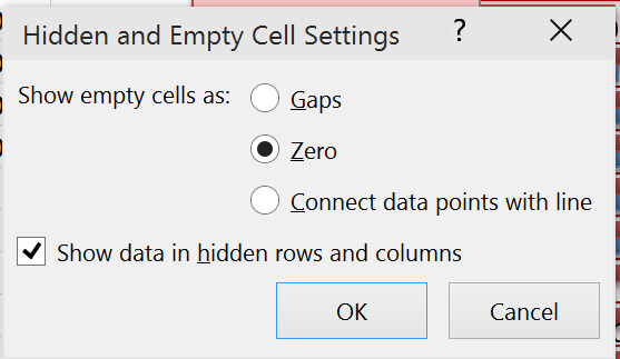
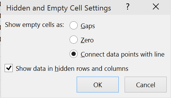
If youve looked at the accompanying Excel workbook, you may have noticed that the source data for my chart has an empty row and a few hidden cells. To edit how a chart interprets such cells, click the Hidden and Empty Cells button in the bottom left corner of the window. This will open the following pop-up:
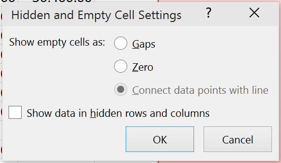
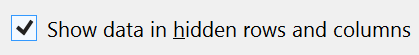
To include hidden cells, ensure the Show data in hidden rows and columns checkbox is checked.
Click ok to update the chart and it will now include the data I have hidden between rows 14:20.
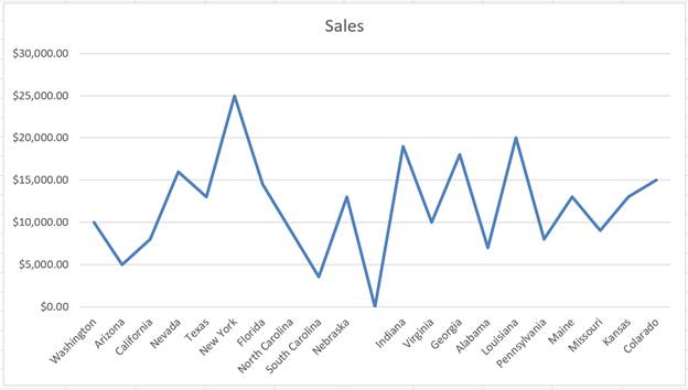
For bar/column charts, empty cells will always be displayed as gaps. In order to make use of these options I have inserted a new line chart for the same data:
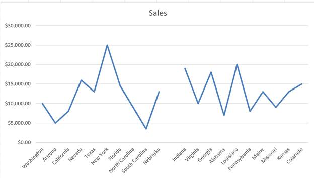
The default option for empty cells is Gaps. This leaves a gap between data entries as you can see above. If you change this to show Zero for empty cells:
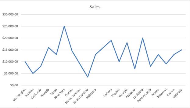
The line chart now goes down to 0 for the empty cells. For this example this is between Nebraska and Indiana.
Now if you change this to the last option, Connect data points with line, instead of going down to Zero for empty cells, a line is drawn over the gap between the last 2 data points that werent empty:
How to Use Data from Another Worksheet for a Chart in Excel
It is worth noting that you can select data from another worksheet within the workbook and not just from within the same worksheet.
To demonstrate this, I am going to change the Costs data series to take a different set of values contained within Sheet2 instead of Sheet1.
To do this, I select the series, click the edit button and adjust the cell references as follows:
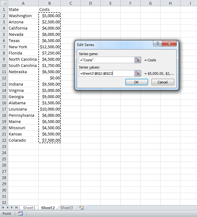
In order to select data from another sheet, select the desired sheet first and then the cell range you require. Click ok and then the chart will update:
Once youve done that, youve basically done almost everything with Data in Charts in Excel that you will ever need to do. This tutorial should get you going for just about all of your charting data related needs and, if it doesnt, make sure to check out our other tutorials!
Question? Ask it in our Excel Forum
Excel VBA Course - From Beginner to Expert
200+ Video Lessons 50+ Hours of Instruction 200+ Excel Guides
Become a master of VBA and Macros in Excel and learn how to automate all of your tasks in Excel with this online course. (No VBA experience required.)
Tutorial: How to highlight the rows of the top and bottom performers in a list of data. This allows...
Tutorial: How to loop through a range of cells in a UDF, User Defined Function, in Excel. This is ...
Tutorial: Display all formulas instead of their output values. This allows you to quickly troubles...
Tutorial: In this tutorial I am going to introduce you to creating and managing charts in Excel. Bef...
Tutorial: Here, I'll show you everything you need to know to get started using tables in Excel; how...
Tutorial: The Future Value function (FV) in Excel will return the future value of an investment ba...
Subscribe for Weekly Tutorials
BONUS: subscribe now to download our Top Tutorials Ebook!
Excel VBA Course - From Beginner to Expert
200+ Video Lessons
50+ Hours of Video
200+ Excel Guides
Become a master of VBA and Macros in Excel and learn how to automate all of your tasks in Excel with this online course. (No VBA experience required.)