
")
Subscribe for Weekly Tutorials
BONUS: subscribe now to download our Top Tutorials Ebook!
Format Any Element of a Chart in Excel
In this tutorial I am going to go through the Format tab in more detail and show you how to Format every element of a chart. The main focus here is on the styling section of the format tab.
You can get to the Format tab in Excel after you have selected a chart:
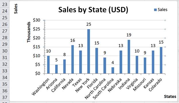
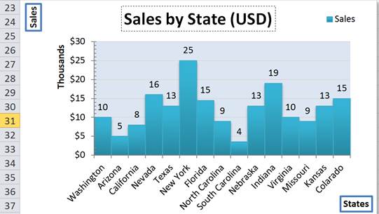
For this tutorial, I am starting with a chart layout built up in the previous tutorial, though without showing minor gridlines.
Format Chart Elements in Excel
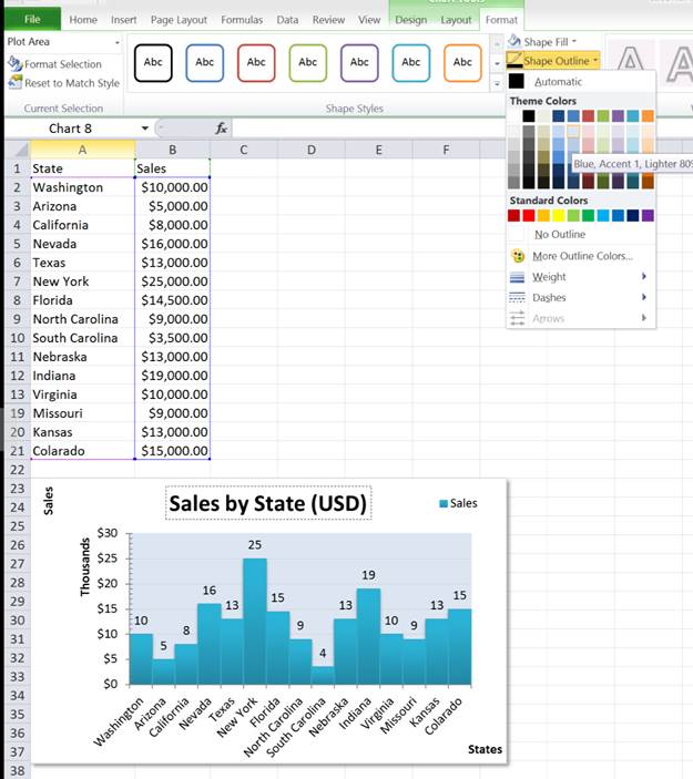
To format any element of a chart, simply select it then choose from the various styling options. For example, I am going to select and edit the Sales data series.
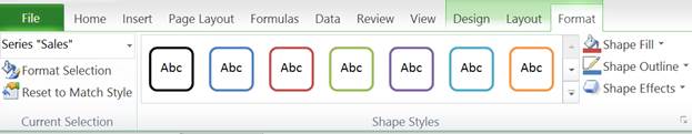
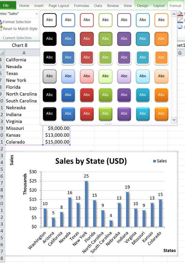
First, I click this data series in the chart (click the data columns) and then the More or just the drop-down button from the Shape Styles section:
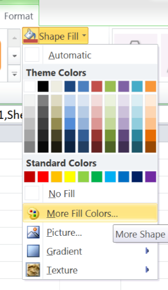
There are a broad range styles available here but if the dropdown options arent enough you can further customize with the Shape Fill and Shape Outline dropdowns.
You can also further expand the Format options by clicking the little button in the bottom right of the Shape Styles section, under the Shape Effects button. This gives you the following pop-up window.
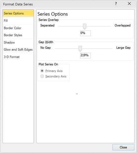
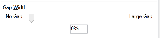
Most of these options are available from the Shape Styles section but there are also additional formatting options depending on the part of the chart you are editing. For example, above there are options for formatting a data series such as how the data is spread out. You can remove the gap between columns by changing the Gap Width option as shown below:
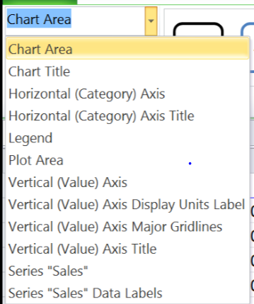
Another Way to Select Chart Elements to Format
You can also select an element of a chart from the Current Selection section on the left of the Format tab. Select an element from the dropdown and click the Format Selection button.
This brings up the Format pop-up. For this example I am going to add shadow to the overall chart area.
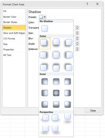
This may seem to be an odd feature but can look quite nice on a chart. See below I have added some shadow to my chart:
The shadow looks especially cool when you remove the gridlines from a worksheet (View tab > uncheck the Gridlines option).
Chart Title Formatting
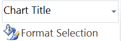
The next part of the chart I will add formatting to is the Chart Title. I do the same as before, I select Chart Title from the dropdown then choose my formatting options.
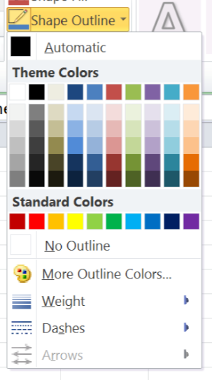
For this example I am going to add a border using the Shape Outline dropdown. First I select a color, then a weighting (how thick the outline will be).
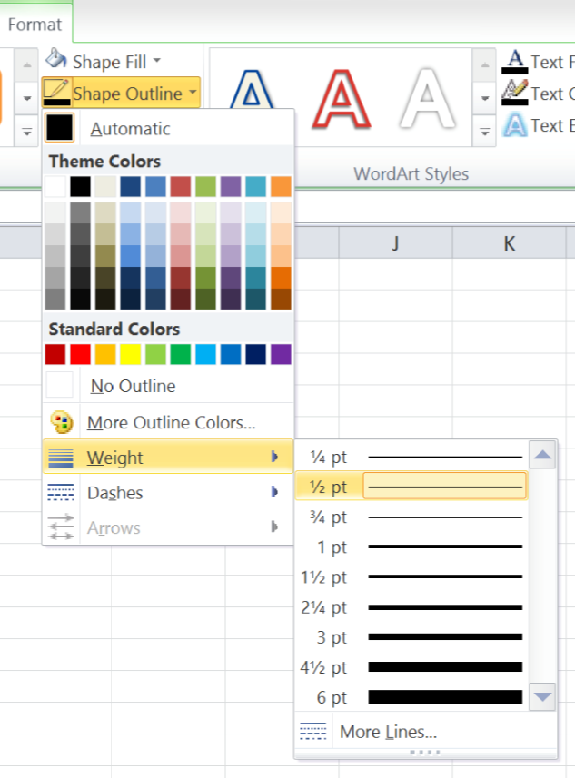
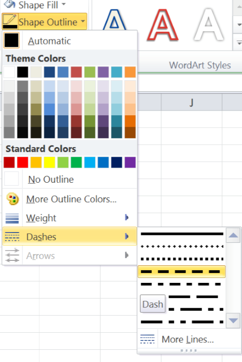
You can also adjust how the outline will appear such as dashing of the outline:
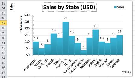
My chart now looks like this:
Plot Area and Axis Title Formatting Examples
Following the same process, I formatted the Plot Area with a light blue fill, by selecting the Plot Area and then changing its fill options:
You can even add formatting to the Axis titles:
Axis Number Type Formatting
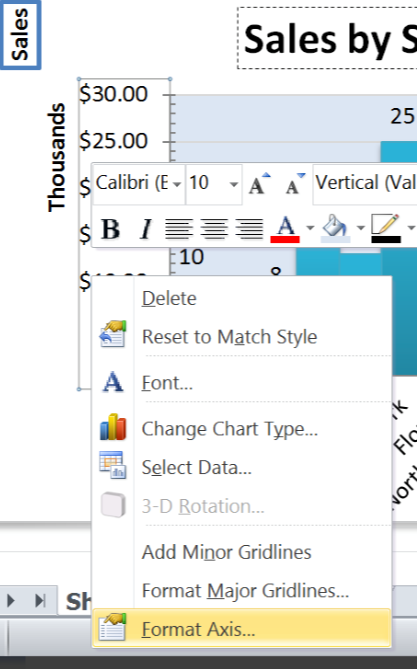
Most of the formatting is the same for most of the parts of the chart but the Axis formatting has some extra functionality. You can apply number Formats the same way you would to cells on the worksheet.
To do so, select the Axis which contains the numbers that require number formatting. Then open up the Format window either via the Format Selection button on the Format tab or by right clicking and then selecting Format Axis.
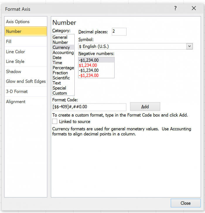
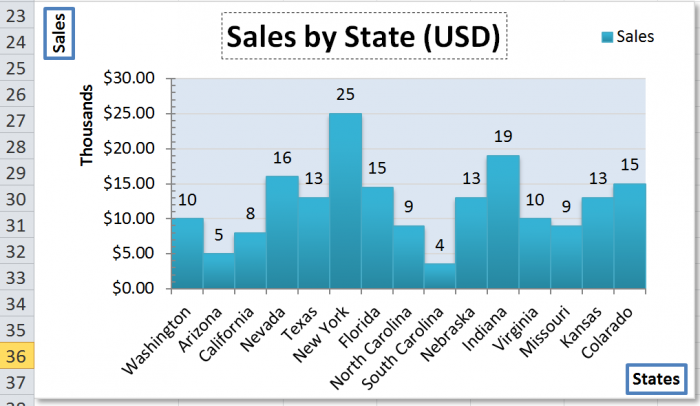
You then select the Number tab. From here you have all the usual number format options such as decimal places, currency, number etc. For this example, I am just going to increase the decimal places from 0 to 2.
Note: You can also apply formatting (including number formats) to your data labels as well. You can also apply formats to data markers in scatter charts via the Format window.
Basically, you can format any element of a chart, to the point where it can get really tedious and annoying; but, once you get everything right, you can have a very nice looking chart that will match any topic or spreadsheet style you need it to match.
Its worth it to download the accompanying spreadsheet and play around with it; select lots of different things on the chart and try to change its formatting to see what you can come up with.