Create Gantt Chart in Excel Easily
Easy step-by-step guide to creating a Gantt Chart in Excel.
Following these steps, it should take no more than 5 minutes to make a Gantt Chart.
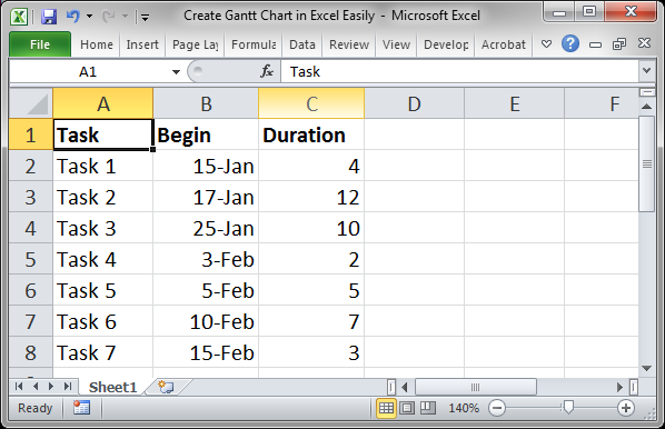
- Setup your data. For a Gantt chart, you need to have one column of data that states when a task will begin and one column next to it that states how long that task will take or last.
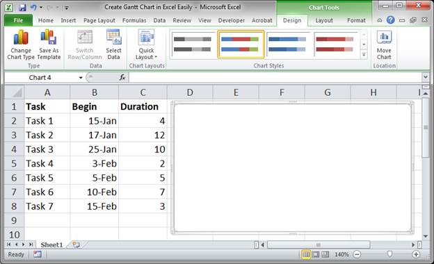
- Go to the Insert tab and click Bar and then select Sacked Bar (make sure that you have NOT selected the data you want to show in the chart before doing this - you have to select a cell outside of your data set)

- You should now have a big blank white square
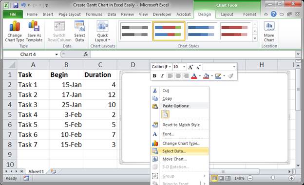
- Right-click in the white square and click the option Select Data...
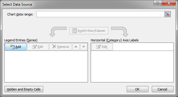
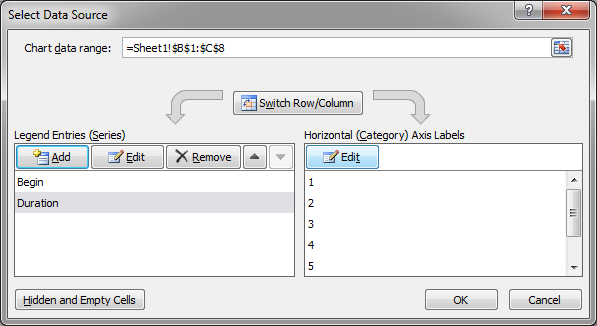
- In the window that opens, click the Add button:
- Click in the text box under where it says Series name and then select the title of the "Begin" dates:
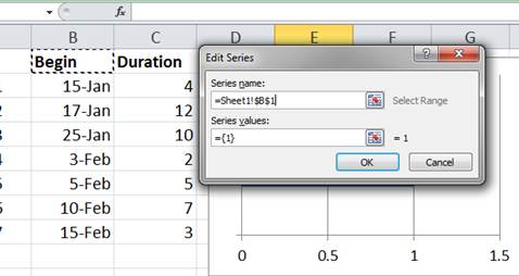
- Click in the text box under where it says Series values and delete whatever is currently there and then select the data under "Begin":
- Click OK and you will be back at this window again.
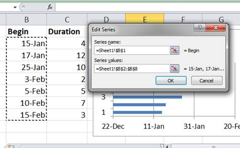
- Repeat Steps 5 - 8 for the "Duration" data and the window should now look like this:
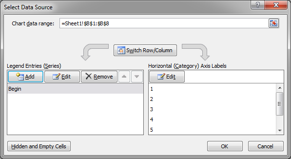
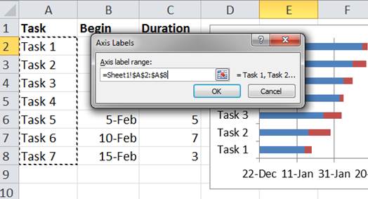
- Click the Edit button under where it says Horizontal (Category) Axis Labels
- Select the tasks and click OK:
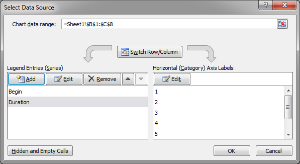
- Now, the window should look like this:
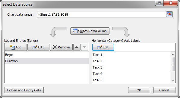
- Click OK to go back to the worksheet. It's now time to format.
First, remove the legend by right-clicking it and hitting Delete: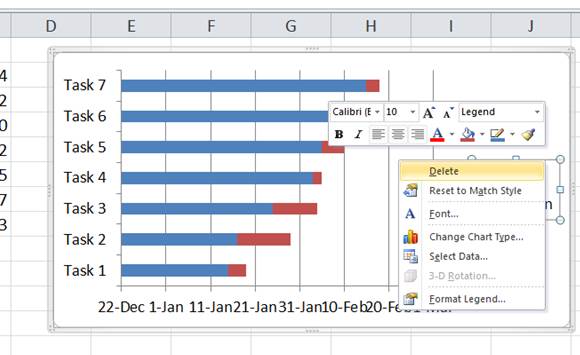
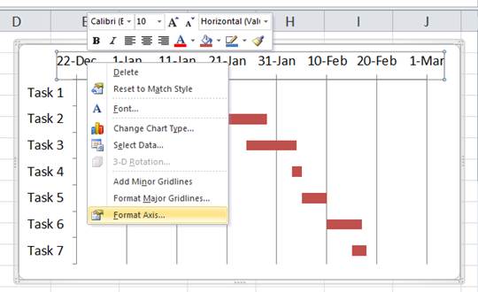
- Then, right-click the Task names and click Format Axis...
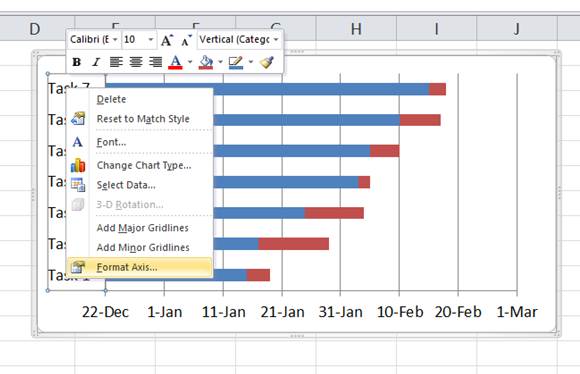
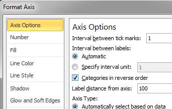
- In the window that opens, select the option Categories in reverse order
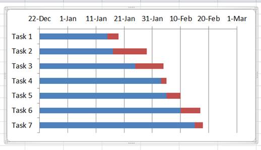
- Hit the Close button and now the chart should look like this:
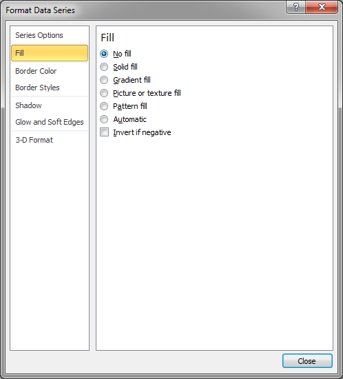
- Right-click over the blue bars in the chart and click Format Data Series...
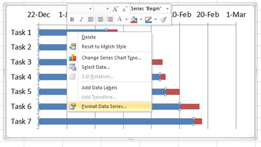
- In the window that opens go to the Fill category and select No fill and then click Close
- Back in the worksheet we now need to do a little trick. Select the first cell in the "Begin" column and then set its formatting to General. Do that by clicking the Number drop down menu on the Home tab:
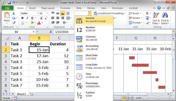
- You will now see a number in this cell; that is how Excel represents dates and we need that number to make the chart look like a Gantt chart. Copy that number, I usually copy/paste it to another cell, and then you can change it back to its date format.
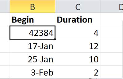
- Repeat Step 19 and 20 for the last date in the Begin column. Once you get the number for the date, you need to add the number from the same row in Duration column to that date number. Otherwise, the chart will stop at the start of the last task.
- Go back to the chart now and right-click the top axis that has the dates and then select Format Axis...
- In the window that opens, click Fixed for all 4 options under Axis Options.
For Minimum put the first date from the Begin column, the number that you got from Step 20.
For Maximum, put the number from Step 21 here.
For Major unit and Minor unit adjust these as desired to make the chart look better. They control the size of the units used to represent the dates. If you don't need to adjust these options, select Auto for them.
When you are done hit Close.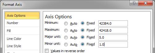
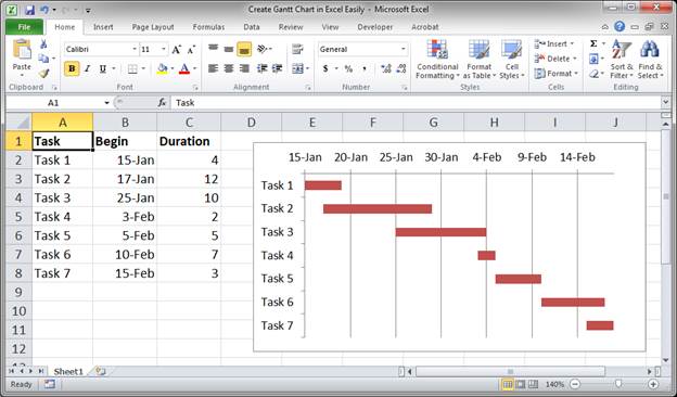
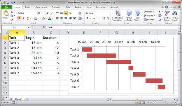
- Now, we have a Gantt Chart!!!!
Extra Formatting Tip
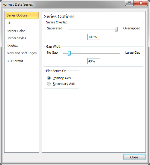
If you want to push the bars closer together simply right-click one of them and click Format Data Series... and, in the window that appears, adjust the Gap Width setting in the Series Options section.
Result:
Notes
Gantt charts can be really useful but they are quite a pain to create the first couple of times. However, I promise you that once you do it a few times, you will be able to make one of these charts in just a few minutes. Don't get stressed, just follow the instructions above step-by-step the first few times and then you will be good to go.
Download the attached Excel spreadsheet to see the Gantt chart from this tutorial.
Question? Ask it in our Excel Forum
Excel VBA Course - From Beginner to Expert
200+ Video Lessons 50+ Hours of Instruction 200+ Excel Guides
Become a master of VBA and Macros in Excel and learn how to automate all of your tasks in Excel with this online course. (No VBA experience required.)
Tutorial: In this tutorial I am going to introduce you to creating and managing charts in Excel. Bef...
Tutorial: How to add, manage, and remove error bars in charts in Excel. Error bars allow you to sh...
Tutorial: How to create a thermometer chart in Excel. This is what we want: Steps to Create a The...
Tutorial: Create a dynamic chart in Excel that displays only the data you want. You can filter it an...
Tutorial: In this tutorial I am going to go through the Layout tab in more detail and show you how t...
Tutorial: How to create dynamic charts that update automatically when new data is added to Excel. T...
Subscribe for Weekly Tutorials
BONUS: subscribe now to download our Top Tutorials Ebook!
Excel VBA Course - From Beginner to Expert
200+ Video Lessons
50+ Hours of Video
200+ Excel Guides
Become a master of VBA and Macros in Excel and learn how to automate all of your tasks in Excel with this online course. (No VBA experience required.)