Changing Any Element in a Chart in Excel
In this tutorial I am going to go through the Layout tab in more detail and show you how to build up chart layouts to get just about any setup you want.
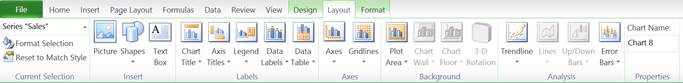
Here is the layout tab in Excel and you can access it once you select a chart that you have already created.
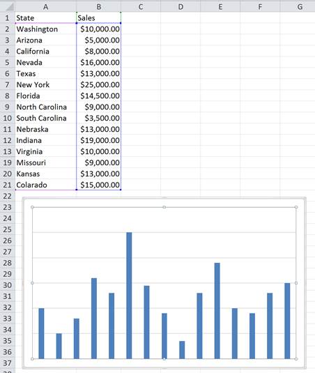
To start, I have inserted a basic chart with no layout features:
The tutorial will now be split up into smaller parts so that each layout feature is easy to understand and so that you can follow along in creating the chart I will develop throughout the tutorial.
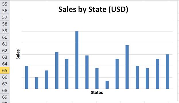
Chart Titles
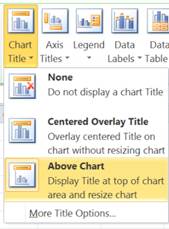
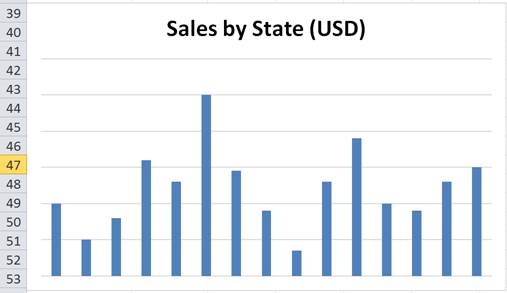
A Chart Title is a basic feature which helps people understand what your chart is showing. To add a Chart Title, click the Chart Title dropdown then choose where you want it to be positioned:
Axis Titles
Axis Titles give titles to each of the axis so it is easy to understand what is being display on each axis. To add Axis titles use the following dropdowns:
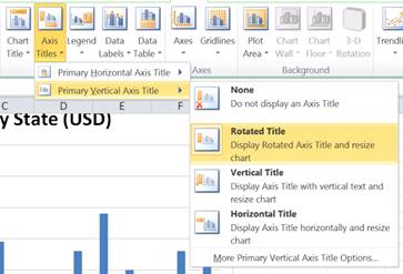
Notice that there are a few orientation options here so that you can chose which way your axis title is displayed.
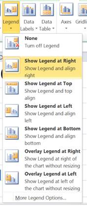
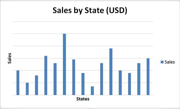
Legend
A chart Legend comes in useful if you have multiple series of data displayed within the one chart. It highlights what color the data points are and makes it easier to distinguish which data series is which. There are a number of different options from the dropdown for where you want to position your Legend with the Chart.
To highlight where a Legend comes in handy, I have taken a screenshot from a chart in an earlier tutorial which has 2 data series.
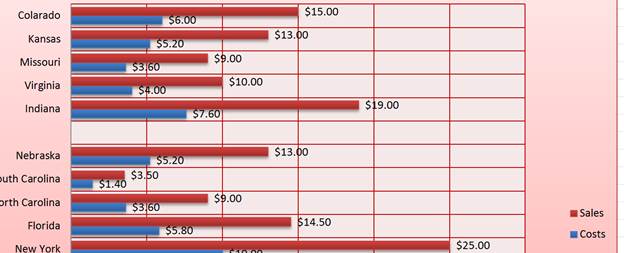
As you can see above, it is easy to tell that the red bars are sales and the blue bars are costs.
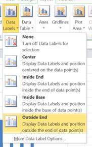
Data Labels
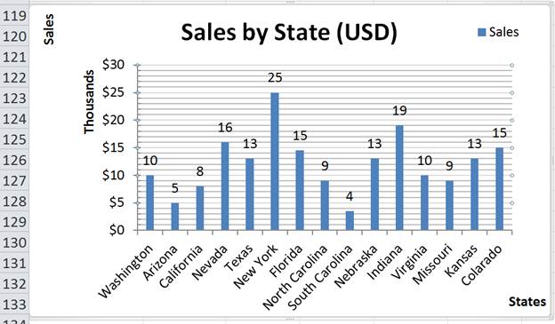
Data Labels makes it easier to see what value a data point represents, particularly when it is in between gridlines.
Some Data Label options may have a lot of overlap, so you may have to adjust some other layout features to make them look good. Though, Ill show how this is done in the next section.
To add Data Labels just select an option from the dropdown shown below. Outside of the data points is generally better as when Data Labels are put over the bars/columns they can be hard to read and understand.
Axes
These options allow you to edit the Axis labels, arrangement and scaling. For the vertical axis, you have the following scale options by default:
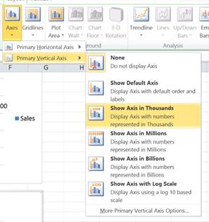
Should you require further layout options, select More Options from the bottom of the dropdown menu to get the following window:
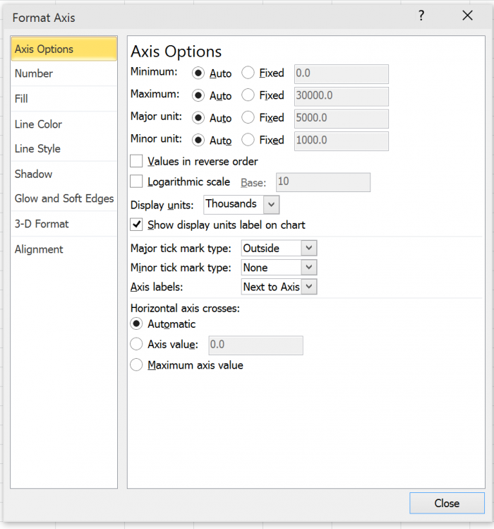
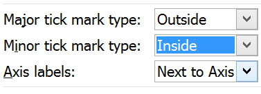
For this particular example I am going to add Major and Minor tick marks:
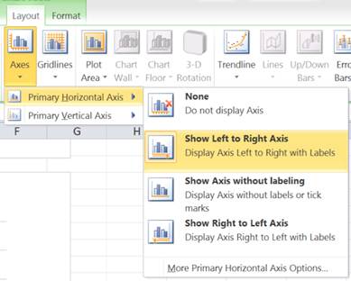
For the horizontal axis you have the following arrangement options such as having your axis going from Left to Right:
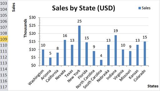
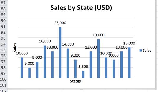
Notice that my vertical axis is now in thousands and so my data labels are a lot clearer and easier to read.
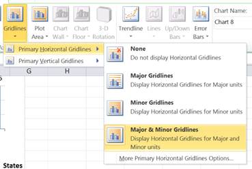
Gridlines
Gridlines allow you to interpret your data easier as you can see where a data point is in relation to an axis label. There are only a few options here as far as layout is concerned.The options are to display Major and/or Minor gridlines on each axis.
This covers all of the main layout features that you will want to add, edit, or change for just about any chart in Excel. To learn more about charts and what you can do with them, make sure to check-out our other tutorials on charts in Excel!
Question? Ask it in our Excel Forum
Excel VBA Course - From Beginner to Expert
200+ Video Lessons 50+ Hours of Instruction 200+ Excel Guides
Become a master of VBA and Macros in Excel and learn how to automate all of your tasks in Excel with this online course. (No VBA experience required.)
Tutorial: In this tutorial I am going to introduce you to creating and managing charts in Excel. Bef...
Tutorial: How to loop through a range of cells in a UDF, User Defined Function, in Excel. This is ...
Tutorial: How to highlight the rows of the top and bottom performers in a list of data. This allows...
Tutorial: Display all formulas instead of their output values. This allows you to quickly troubles...
Tutorial: In this tutorial I am going to go through the Format tab in more detail and show you how t...
Macro: Create a bar chart in Excel with this macro. You will be able to quickly and easily turn a...
Subscribe for Weekly Tutorials
BONUS: subscribe now to download our Top Tutorials Ebook!
Excel VBA Course - From Beginner to Expert
200+ Video Lessons
50+ Hours of Video
200+ Excel Guides
Become a master of VBA and Macros in Excel and learn how to automate all of your tasks in Excel with this online course. (No VBA experience required.)